First time users - create first dashboard and report
Create your first dashboard
Before you create your first dashboard, you should know that:
- There won't be any reports to select from.
- There is no way to create a report without going through a dashboard.
- Once you create a report through one dashboard, it can be used for any dashboard.
- You must have the 'Content Creator' permission enabled in your user account before you can create a dashboard. Without this option enabled, you will be able to view the dashboard but not edit or create one.
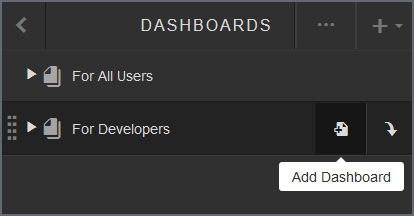
Create and name the dashboard
- Click
the folder in the upper right-hand corner.
Choose from:
- For All Users: Dashboards under this folder can be viewed/used by anyone. Users with 'Content Creator' permission can also edit/change these dashboards.
- For Developers: Dashboard under this folder can be viewed and edited by users with the 'Content Creator' permission. Users without the 'Content Creator' permission cannot view a dashboard under this folder.
- Create your dashboard under the 'For Developers'
folder to allow collaboration with other developers and keep the dashboard
from general users. Once complete, you can move the dashboard to 'For
All Users' so everyone can access it.
- Now,
give the dashboard a name:
- Hover over New Dashboard and click the field.
- Backspace over New Dashboard and enter the dashboard name.
- Click the X or click outside of the naming field.
- Not
happy with the name? You can change it anytime, just hover over the name
and click the edit pencil.
Note: If your dashboard name does not follow the naming conventions, or if another dashboard with that title exists in the same collection, a message displays.
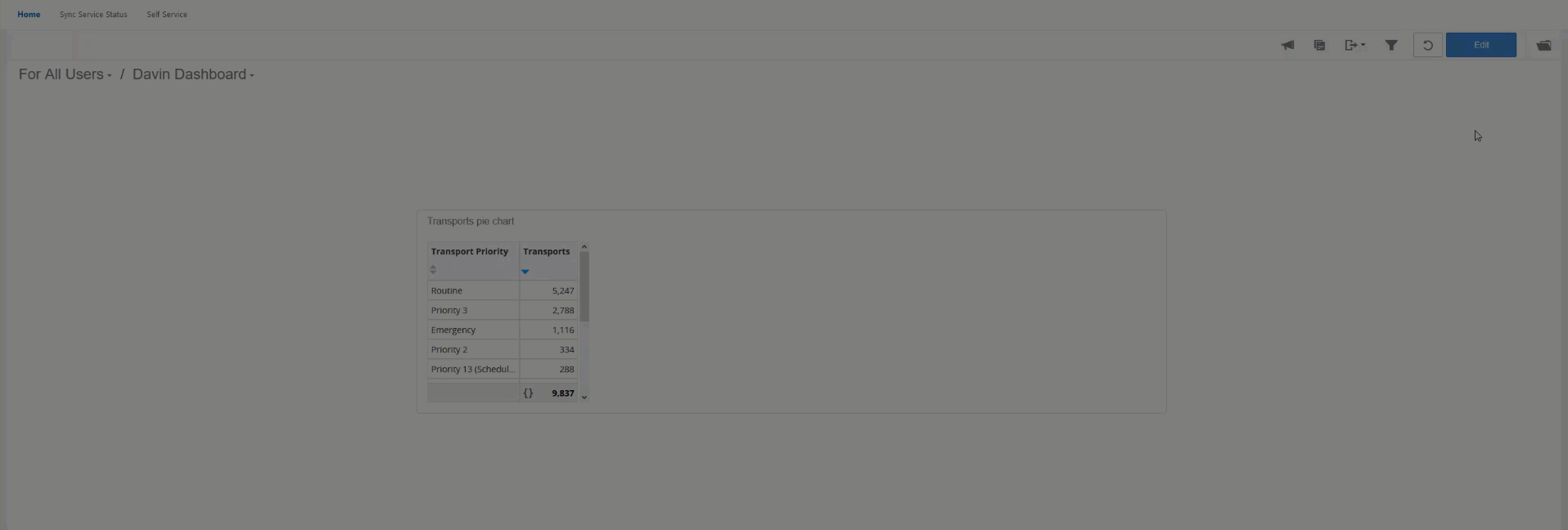
Create your first report
As more and more reports are created, you will be able to select or modify an existing report to display on your dashboard. Because this is your first dashboard, there won't be reports to choose from so you will have to create a report from scratch.
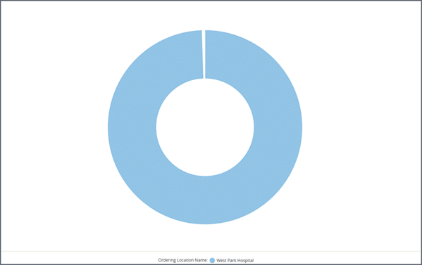
Before you start creating the new report, have an idea of what you are trying to accomplish. For our example, we would like to create a report that shows the number of transports and the transport priorities visualized in a chart.
On the toolbar, click Insert  > New Report.
You will now be in Visualizer. Here's an example of the Visualizer screen.
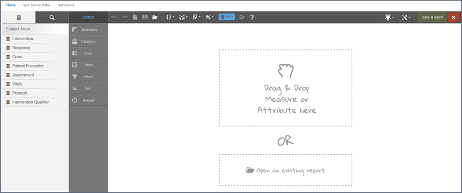
It will make your life easier if you know what the columns/sections in Visualizer do, so let's break it down.
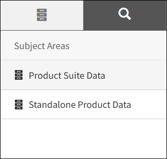
Subject Areas
This is where you select the data for the report. If your company does not use RescueNet ePCR, you will see two folders labeled "Standalone Product Data" and "Product Suite Data". The "Standalone Product Data" folder will have all the available subjects to select from to build your reports, such as Assessment, Billing Claims, Crew, and Intervention. Click on a subject to drill down and select measures, attributes, and common data elements.
The "Product Suite Data" folder contains sub-folders for ZOLL Dispatch, ZOLL Billing, and emsCharts correlated data that is only used for reconciliation reporting. Your company must use all three products to leverage the data in the "Product Suite Data" folder.
Note: ZOLL Dispatch customers have been updated with the new folder structure but ZOLL Billing customers are in the process of being updated. ZOLL Billing customers will still see the old structure until your company has been updated.
If you drill down into a specific folder or subject and need
to start over, click the Subject Area icon  .
.
If your company uses RescueNet ePCR, you will not see the "Product Suite Data" and "Standalone Product Data" folders and will instead see the subjects to choose from to begin building your report.
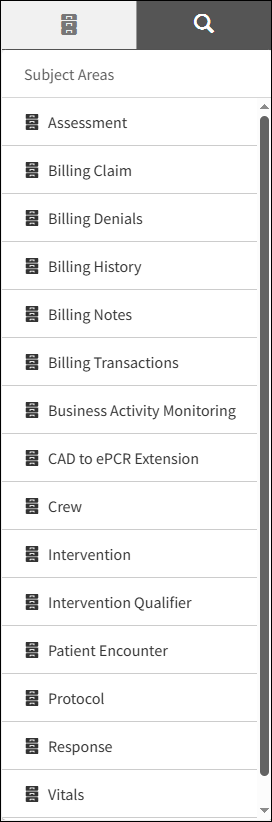
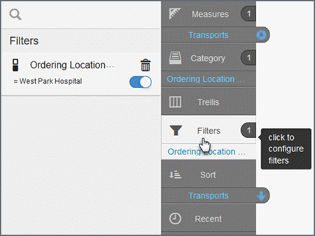
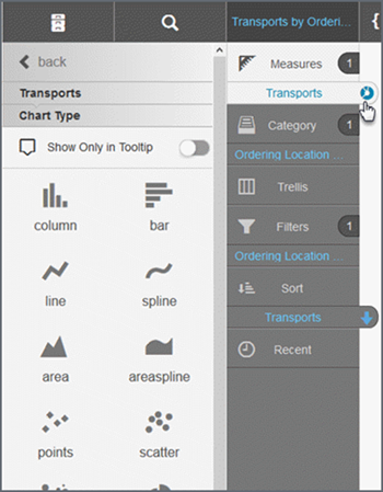
Chart builder
Chart Builder gives you a visual representation of the data options selected in the Subject Area. For more details on the selection, hover over a blue title.
But wait! There is so much more this section does:
- If you start with the chart type, Chart Builder shows the minimum measures, categories, etc., that you need for that chart type. If you start with data, Chart Builder shows your selections as you make them.
- Click
a tab for more options. For example, click the 'Filters' tab to create
a report filter.
- Considering
a different visualization? Click the chart type icon on the measure and
select from the list.
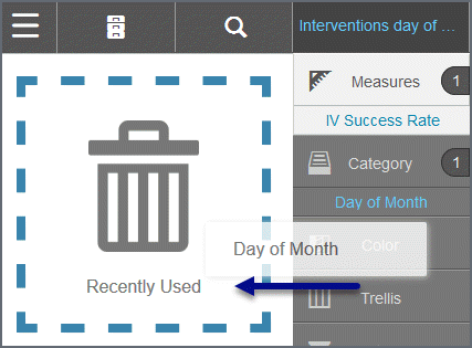
- It is
easy to delete an element- click on the name, hold your mouse button down
and drop it on the trash can.
Important! Chart Builder can disappear in your web browser if you change the browser font size from medium (recommended) to large or extra-large. If you revert the font size back to medium, Chart Builder will be restored.
Canvas
As you add build or modify the report/chart, the canvas changes to show you how the report/chart will look.