Filters
Filters can be used to explore different levels of detail. For example, a filter can show a subset of a group of items or a range of dates.
Important: Filters can be used across multiple dashboards. When you edit a filter, the changes apply to all instances of the filter on any dashboard in the space.
There are two types of filters, standard and embedded. A standard filter can be used across multiple dashboards and can be turned on/off for individual dashlets on a given dashboard. An embedded filters are used in dashlets.
Operators for advanced filters
Create parent/child filter groups
Using filters
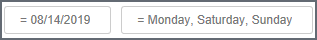
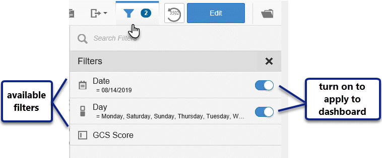
When standard filters are active, a card for each filter displays under the Dashboard name,
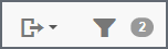
and the number of active filters displays next to the filter icon.
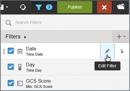
You can make changes to the active filter by clicking the filter card or the filters menu. Click Apply to apply the changes to the filter.
To see the number of available filters, click the filter menu to open Filter Drawer.
Creating and editing filters
If you are in the Edit mode, you have the option to create new filters/filter groups and edit existing filters from the Filter Drawer.
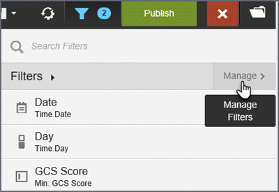
- Click the filter icon.
- On the
Filter Drawer, click Manage.
Add a filter
- Click
the plus sign.
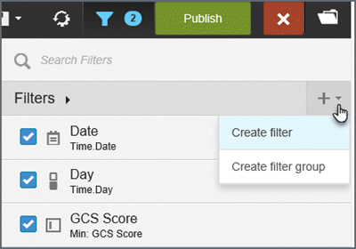
- Click Create filter.
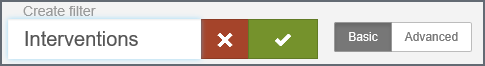
- Enter
a name in the 'New Filter' box and then click the check box.
- To
pick the filter, either:
- type
to search for columns,
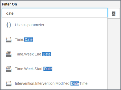
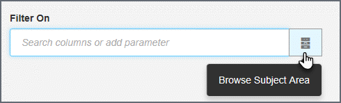
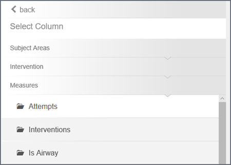
- select/change
the subject areas to browse attributes and measures,
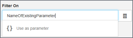
or, type a parameter name and click Use as parameter. Parameters are useful in expressions and custom formulas.
- type
to search for columns,
- Click Create filter. The new filter displays on the filters list.
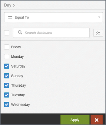
About the check boxes: When you select a filter, the dashlets on the page display a filter icon in the lower right corner to indicate that the filter is associated with them. If you do not want a filter applied to a dashlet, click the filter icon to deselect it.
Edit a filter
- Edit
a filter: Hover over the filter name and select the edit icon.
- Make the needed changes and click Create filter.
About the check boxes: When you select a filter, the dashlets on the page display a filter icon in the lower right corner to indicate that the filter is associated with them. If you do not want a filter applied to a dashlet, click the filter icon to deselect it.
Filter format options
Use the Create Filter panel to define filters.
Important: If you edit an existing filter the changes will be applied to any dashboard that uses the filter. If you do not want to apply the changes across all dashboards using the filter, rename it to create a new filter.
By default the Create Filter panel opens in 'Basic' options mode.
Tip: The system picks a default filter style based on the data type of the 'Filter On' attribute or measure. For example, integer type filters by default use the slider style. You can change that style in 'Advanced' mode.
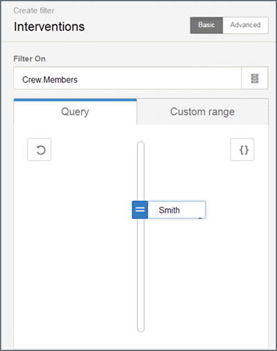
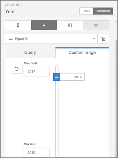
Filters can be based on queries, custom lists, or ranges.
- Query-based filter: Pick from values provided by the system. Specify a default value(s) or custom expression.
- Custom list or range-based filter: Pick from a list (text-based) or a numeric range of values that you define. This is helpful if you want to show different labels. Naturally, these values must exist in the data source. For a list, specify a radio button or check box, enter the labels and values, and click the defaults.
- Range-based filter: Specify the maximum, minimum, and default number.
Advanced filter options
Click Advanced to apply a check list, slider, value or calendar date pick filter style, and define operators.
Creating a check list
By default, the Create Filter drawer opens in 'Basic' mode for creating checklist filters (check box or radio button). Populate the filter values by either running a query or specifying a custom list.
- Check box: Allow users to select multiple values
- Radio button: Permits users to select only one value
- Select values in the Defaults column to specify the filter value to apply when the user opens the page
Tips:
- If there are many filters in the list, use search to quickly find what you need.
- If a large number of results are detected, a warning displays and suggests that you refine your query.
- Click the folder icon to browse other subject areas.
Using sliders
Move a slider to narrow the filter results. Sliders are available for date, datetime, and integer columns. You can additionally set a custom range for the slider.
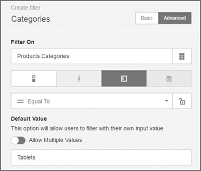
Using values
Value filters provide a text entry field so you can type your own filter value.
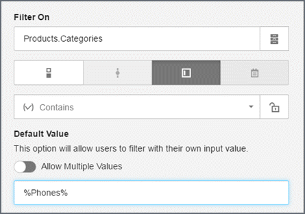
Allow partial texts with wildcards
Use the 'Contains' operator to allow the entry of partial texts with the percent wildcard. The percent sign is required for the 'Contains' operator.
Allow multiple values
To use multiple values, toggle the 'Allow Multiple Values' option to 'On' and enter a default value.
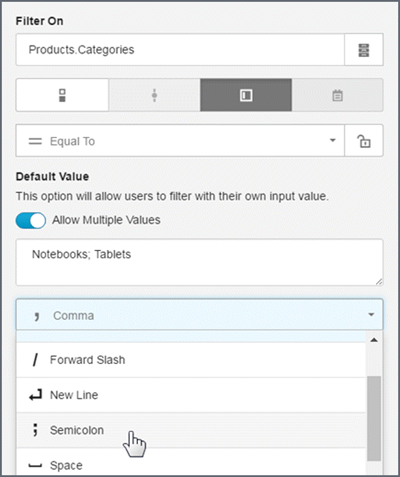
Tips:
- The default delimiter is a comma (,). You can change the default if needed.
- The supplied delimiters include: tab, space, semicolon, forward slash, and comma.
- Enter a custom delimiter (do not use a percent sign %).
- Use the specified delimiter in the default value texts.
- For multiple values, the generated BQL uses an OR operator in the query.
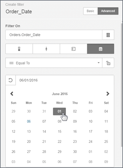
Calendar (date picker)
Calendar date picker filters are supported for the date data types. Calendar filters cannot be embedded. The filter editor shows what a published dashboard will look like.
Set default values, including start and end values.
Operators for advanced filters
Advanced filter modes can apply operators such as:
- equal to or not equal to
- greater than or equal to
- less than or equal to
- contains, does not contain
- missing, is not missing
- between
- outside
Tip: When using the Contains or Does Not Contain operators, users can add the percent character (%) to search strings. The percent character acts as a wildcard around keyword strings. For example, "%Company%" returns all values where "Company" exists in the string. "Company%" returns all values that begin with "Company".
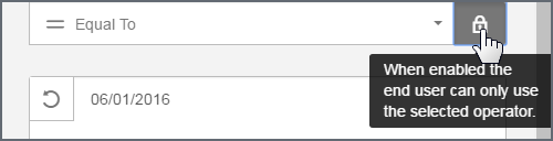
Locking a Filter Operator
By default end users can change the operator of a filter. If you do not want to provide this feature to end users, you can restrict the filter to use only the operator that you created. Click the lock icon to lock a filter operator. For example, you can lock a date picker so that end users cannot select a range, they can only select one date.
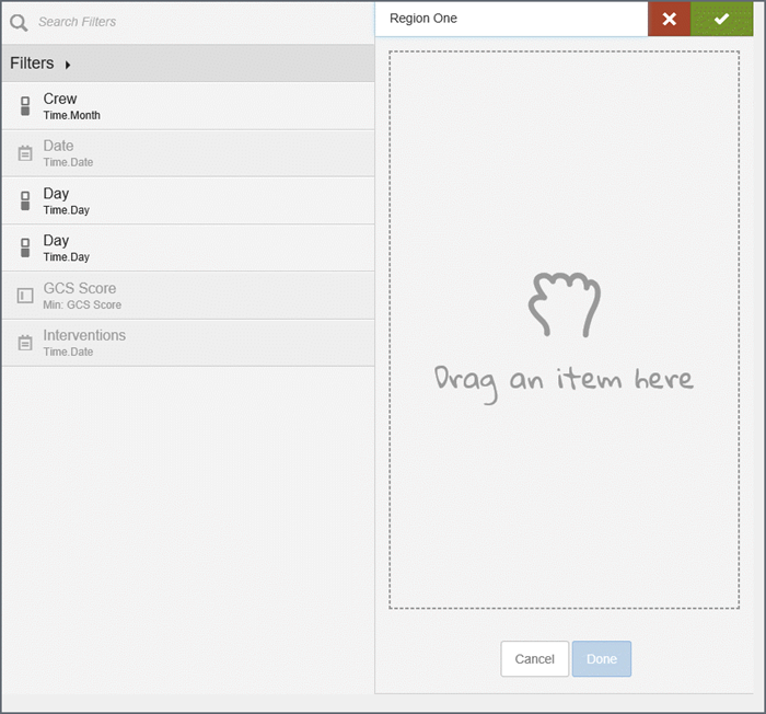
Create parent/child filter groups
Parent/child filter groups are sets of related filters that allow the user to narrow down a set of results based on a logical hierarchy of sets and subsets, such as geography or time. Filter groups are supported for standard filters only, not for embedded filters.
Tip: When you add a filter to a filter group, the system creates a copy of the original filter. Because the filters in a filter group are copies, you can make changes to a filter in a group without affecting the original filter outside the group.
- Create the
filters. For example, 'Region one' and 'Region two'.
Tip: For better performance and usability, set a default value for the top filter in the group.
- Click the
plus sign.
- Click Create filter group.
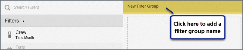
- Click New Filter Group to add a name
and then click the check mark.
- Select
a filter on the left and drag
it to the right.
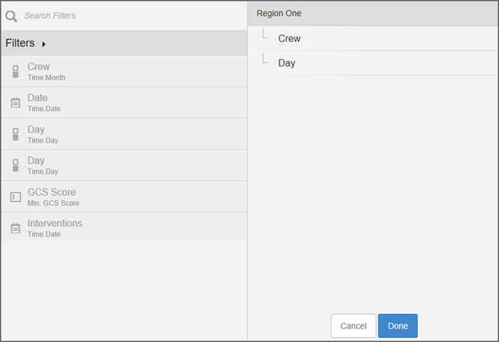
- Drag the
filters within the group panel to situate them in the preferred order.
Tip: Drag a filter to the right and underneath to make it a sub-filter.
- Click Done. The filter group displays
on the list.
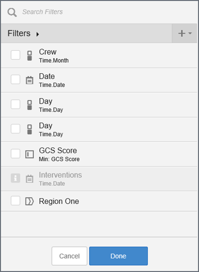
- Check the box to enable the filter group.
- Confirm which dashlet reports this filter group applies. Dashlets with the filter show a filter icon. Click the icon to disable the filter for that dashlet.
- To save the dashboard, click Publish.