Formatting Data
Format measure values in a chart
Adding attributes using colors, shapes, or sizes
You can display measure data in formats such as axis, tooltips, and display values, including:
- Unit symbols that represent magnitude, such as M for millions
- Suffix symbol for percentages (%)
- Decimal precision display
- Currency symbols
In addition, you can format currency symbols and decimal places for any measures, including:
- Measure type expressions created in Visualizer
- Custom measures created in the Admin module
Tips:
- Currency and date formatting also depend on the user's language locale setting.
- You can override the data formatting at the chart formatting level for axis, tooltip, and display values. For example, set the Y axis unit on a chart to be different than the tooltip unit.
Format measure values in a chart
- In Visualizer, click a measure in ChartBuilder.
The options menu displays a section for each measure.
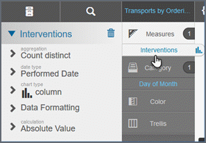
- Select
the column you want to change
and then click Data Formatting.
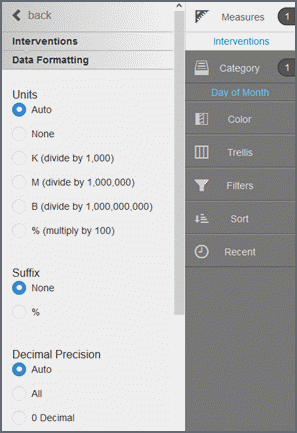
- Select the unit for formatting numbers.
- Select the suffix (for display purposes only).
- Select the decimal precision.
- Select the currency symbol (for display only - this does not change the data).
- Click Save.
Tips:
- Visualizer supports dynamic currency symbols. You can define a variable and use it as the currency format by entering the GetVariable('variable_name') syntax.
- Dynamic currency symbols using the GetVariable is not supported.
- If you have merged more than one measure on the axis and the currency symbol is not the same for each measure, Visualizer does not display a currency symbol on the axis. To display a currency symbol on a merged axis, set both measures to use the same currency.
- You can override formatting at the data level with formatting at the chart level.
Adding attributes using colors, shapes, or sizes
Use colors, shapes, or sizes to add attributes for more complex charts. Based on the type of the column, Visualizer helps you choose between different visual elements and chart types.
After you add the first measure and attribute, as you drag another attribute from the Subject Area to Chart Builder or the Canvas, Visualizer recommends a visualization. Drop the measure or attribute over the desired option and Visualizer will create the new chart style.
Add colors
- In Visualizer, add a measure and an attribute to plot a chart. For example, interventions by year/quarter as a column chart.
- Divide
the columns into colored sections that represent another visual dimension.
- Search or browse for an attribute and drag
it to Chart Builder. You can either:
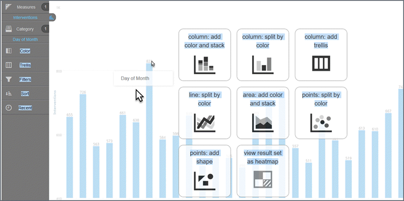
- Drag and drop the attribute onto 'Color'.
- Drag and drop
the attribute onto one of the
suggested visual options.
This is also a way to change the chart type.
When you use the Chart Settings > Color bucket, you can select different ways to visualize your data for your chart type.
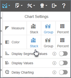
If you display segments with a stack, you can toggle the Display Segment Values option to show the values within the segment (space permitting).
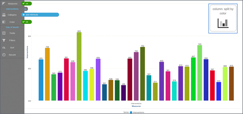
You can change how the Region dimension colors appear in a column chart. The following examples shows split by color.
- Search or browse for an attribute and drag
it to Chart Builder. You can either:
- Click Save.
Add sizes
Some visualizations are more useful when you add a dimension represented as 'Size'.
You can add a measure to a bar chart and change it to another chart type that uses 'Size'.
Drag the measure to the Canvas. Visualizer suggests charts that work best with Size.
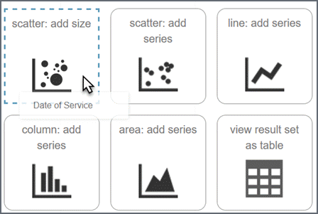
On the chart, hover over a data point to see details.
Click Save.
Tip: Click items in the legend to show or hide bubbles in a bubble chart.
Add shapes
Some visualizations are more useful when you add an attribute represented as 'Shape'.
You can add an attribute to a bubble chart and change it to another chart type that uses 'Shape'.
Drag the attribute to the Canvas. Visualizer suggests charts that work best with 'Shape'.
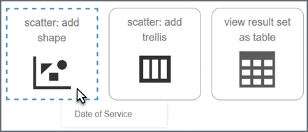
Click Save.
Tips:
- The legend has an include/exclude toggle to show/hide labels.
- When a legend gets large, it hides some of the items. To see hidden items, click the plus sign.
Trellis charts
Use trellis charts to identify patterns and trends across a series of charts. Since a trellis includes smaller charts, it works best to start with simple charts that are easy to understand and easy to compare.
- In Visualizer, add one or more measures
and attributes to plot a chart. You want to see a miniature version of
the chart for each attribute.
Add an attribute by either:
- Dragging and dropping the attribute on one of the suggestions on the Canvas.
- Dragging and dropping the attribute on Trellis in Chart Builder.
- Click Trellis in the Chart Builder to
see the different options. For example, the Categories attribute is arranged
as a horizontal trellis (the charts are stacked horizontal to each other).
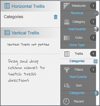
Tip: To remove the trellis charts, drag the attribute from Trellis in Chart Builder and drop it on the trash in the Subject Area.
Change the charts to vertical or horizontal.
- Click Save.
Layered charts
Combine multiple charts types to create layered charts - like overlaying a column chart with a line chart.
- In Visualizer, add one or more measures and attributes to plot a chart.
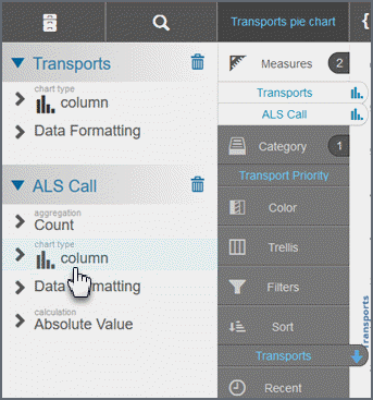
- Select a measure and then select 'Chart type'.
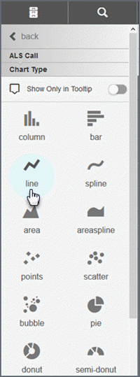
- From the list that displays, select the chart before this measure. If you select a type that is not allowed, a message displays.
- Click Save.
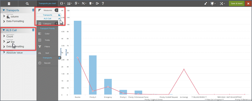
The chart type displays next to the measure and the graph changes to display the two chart types.
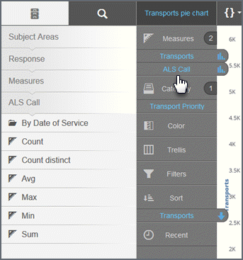
Here's an example:
Select a measure.
Select the chart type.
Select the chart type from the list.
Check the results.
Tips:
- To change the line chart to a spline chart, click the tab with the line icon then select spline from the list of chart types.
- If your chart has more than one axis, you can click Merge Axes to combine the axes into one. If the scales are too different, merging the axes may not produce desirable results. To spit a merged axis, click Split Axes.
Default tooltips
Tooltips display by default for all columns. They contain the measure name and data, as well as the attribute name and value.
You can change how tooltips display:
- Colors and fonts: By default tooltips have a black background with white text. You can change the text. (see Format Tooltips)
- Formatting style for prefixes, suffixes, and decimal precision: To format styles consistently at the chart level (see Format Tooltips).