Creating Basic Analytics Reports and Dashboards
Here are some steps to help you get started creating basic analytics reports. While this information will help get you started, ZOLL emsCharts Analytics is a powerful tool and it will take you time and practice to fully realize and master everything you can do.
Instructions on enabling Analytics
Hints and tips to help you build reports
Visual report examples and configurations
Accessing ZOLL emsCharts Analytics
-
Login to ZOLL emsCharts Web under your service.
-
Click on Analytics in your left side bar.
Notes:
-
You must be logged in under a Service to see the Analytics link even if it is enabled for your other login types (Command Facility, Hospital, Region, etc.). Go here for steps to change your login type once you have launched Analytics.
-
Talk with your administrator if you don't see the Analytics link in the left side bar. If you are an administrator, here are steps to enable Analytics.

-
-
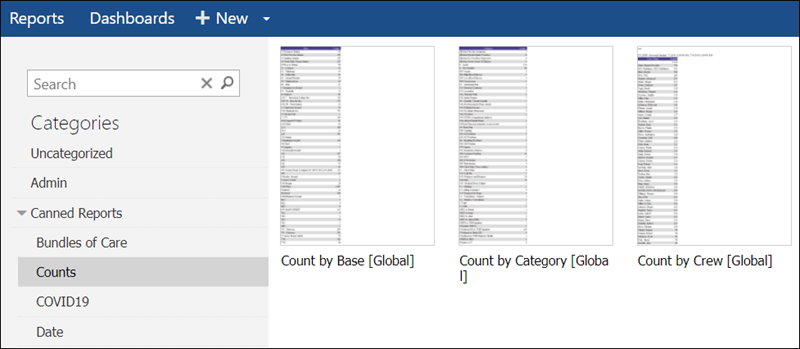
You will be brought to the Analytics home page where you will see all your report categories on the left. Select a category to see all the reports for that category.
Note: You will only see the categories and reports you have access to.
-
Select one of the following for steps to:
Create or modify a report
Watch this video to see how to create or customize a basic report.
-
Before you dive in, it is helpful to think about what you are trying accomplish since that will determine the data sources you will need to use. Do you want to see the number of ePCR's for your base sites? Or maybe performance metrics for your crew members administering a specific procedure?
-
Create a new report or modify an existing report.
-
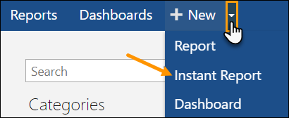
To create a new report, click + New.

Note: If you click the drop-down next to + New, you can use the Instant Report option for a new UI to build your report. The Instant Report UI has the same functionality as the Standard UI and will show you a preview of your report in real time as you make changes.
-
To modify an existing report, hover over the report you want to modify and click the edit icon.
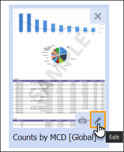
Note: If you don't want to overwrite the report, you can create a copy of it by editing the report and then using the Save As option to save a copy under a different name.
Standard UI

Instant Report UI

-
-
Choose your data sources and fields to report on, visuals you want to use, and any styles and filters you want to apply to your report. Click on Standard UI or Instant Report UI to learn more about the different tabs in each view.
Note: Make sure to save often as you work on your report - there is no auto save.
The tabs outlined below are used to build your report.

DATA SOURCES: Choose what data to include in your report.
Note: The more data sources you add to your report, the longer it will take your report to generate.
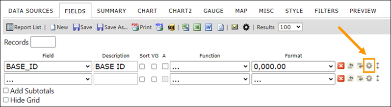
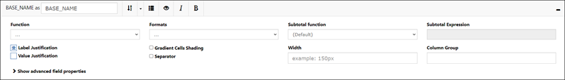
FIELDS: Choose what fields you want to include in your report. You can also choose how the fields function and are formatted.
Note: The Advanced Field Settings option allows you to add custom expressions to your fields and modify advanced properties.
SUMMARY: You can create a table that will summarize your chosen fields using different functions or grouping options.
Note: This tab has similar functionality as the FIELDS tab but instead of the Quick Add and Pivot capabilities, you can use the Add Deltas option so your report will display changes in field values based on the calculation options you choose. For example, you could show the changes in unit response times in a date range.
CHART: Choose between different visualization options for displaying your data.
CHART2: Choose a second visualization option if you want two different visuals.
GAUGE: Choose between different gauge styles if you want to display your data as a gauge.
MAP: Choose options for displaying geographic data on your report.
MISC: Add a title, description, and header and footer to your report. You can also set access rights (who has permissions to view and modify reports), and schedule your reports to run automatically.
STYLE: Add some finishing touches to your report by changing colors, fonts, reorder the visuals, and much more.
FILTERS: Add filters to narrow down the results you see in your report using specific values. For example, you can use a date field filter so you only see results for a specific time period.
PREVIEW: See what your report looks like with the current settings.
The tabs outlined below are used to build your report.

Note: Some of the functionality from the Standard UI has been consolidated or moved, such as the filtering options which are now in the toolbar.

DATA: Choose what data sources and fields you want to report on.
Notes:
-
The more data sources you add into your report, the longer it will take your report to generate.
-
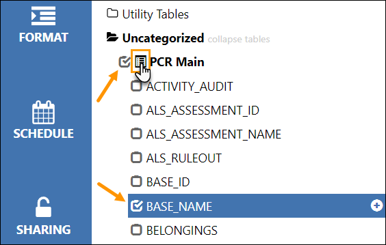
Expand out each category to see the data sources available.
-
Use the "list" icon next to a data source to see all of its available fields.
-
Check the box next to the data source and fields you want to use in your report and the field settings workspace will appear at the bottom of the screen.
-
CHARTS: Choose between different visualization options (including gauges and maps) for displaying your data.
FORMAT: Add some finishing touches to your report by changing colors, fonts, reorder the visuals, and much more.
SCHEDULE: Schedule your reports to run automatically.
SHARING: Set access rights to determine who has what access to your report.
-
Save your report and it will be available to run in your Analytics reports list.
Create or modify a dashboard
A dashboard is a collection of reports that you can see all at once in the same view. Watch this video to see how to create or customize a dashboard.
-
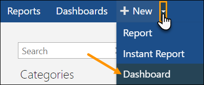
To create a new dashboard, click the drop-down next to + New and select Dashboard.
-
To modify an existing dashboard, click on the Dashboards link in the toolbar.

-
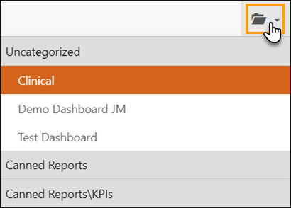
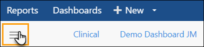
Click the dashboard categories icon on the right side of the page and choose the dashboard to modify.
Note: If you don't want to overwrite the dashboard, you can create a copy by opening it and then using the 'Save dashboard as' option to save a copy under a different name. Step 4 below shows you how to save.
-
-
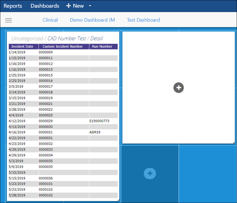
In the dashboard workspace, you can click a blue square to add a report placeholder.
-
Click the plus icon within the report placeholder to select a report to display in that space.
-
Re-size the reports within the workspace by clicking and dragging any edge of the report or report placeholder.
-
-
Save your changes after adding the reports you want to your dashboard.
-
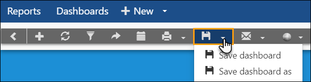
Click the dashboard tools icon.
Note: This menu has advanced options like filters.
-
Click the save icon then click Save dashboard.
Note: Use the 'Save dashboard as' option to save a copy under a different name.
-