Summaries, Trends, and Velocity
CPR Performance
CPR Event Summary
The CPR Event Summary displays an overview of events that occurred during the life of the case.
The summary begins when the system detects a CPR period, CPR compression, ventilation, EtCO2, or delivered shock.
A lightning bolt indicates that a shock was delivered.

The time at the bottom of the summary represents the time the case took place (not time duration).
Each event is color coded.

Depth Summary
The Depth graph displays the compression depth of each compression relative to the target depth range.

Header:
- Depth: Defaults to an adult target range of 2.0 to 2.4 inches. The numbers will change based on your CPR Quality Settings.
- Percent: The percent of CPR compressions that fell within the target depth.
- Average CPR depth: This value is determined by the sum of the depth of all compressions within CPR periods, divided by the number of compressions in CPR periods.
Light blue horizontal line (manual compressions only): The target depth range configured on the Settings page. This range should be set for optimal perfusion and patient outcome.
Vertical blue lines (manual compressions only): CPR compressions that fall within the target range.
Vertical gray lines (manual compressions only): CPR compressions that are too deep or shallow.
Blue shading: AutoPulse CPR compressions.
Orange shading: CPR compressions performed with ResQCPR.
When you hover your mouse over any compression line, the system displays the depth for that compression.
Rate Summary
The Rate graph displays the compression rate of each compression relative to the target rate range.

Header:
- Rate Target: Defaults to target range of 100 to 120 cpm. The numbers will change based on your CPR Quality Settings.
- Percent: The percent of CPR compressions that fell within the target rate.
- Average CPR rate: This value is determined by the sum of the rate of all compressions within CPR periods divided by the number of compressions in CPR periods. Compressions with a rate below 40 compressions per minute are excluded from this calculation.
Light blue horizontal line (manual compressions only): The target rate range configured on the Settings page. This range should be set for optimal perfusion and patient outcome.
Blue dots (manual compressions only): CPR compressions that fall within the target rate.
Gray dots (manual compressions only): CPR compressions considered too fast or too slow.
Blue shading: AutoPulse CPR compressions.
Orange shading: CPR compressions performed with ResQCPR.
When you hover your mouse over any compression line, the system displays the rate for that compression.
Compressions in Target
The Compressions in Target graph displays the compressions in the case that are in target for both depth and rate.

Header: Percent of compressions in target.
Blue lines (manual compressions only): Compressions that meet both depth and rate targets.
Blue shading: AutoPulse CPR compressions.
Orange shading: CPR compressions performed with ResQCPR.
Release Velocity
Release velocity refers to the speed of compression release off the chest. According to research, there is a correlation between the release velocity speeds above 400mm/s and improved patient outcomes.

Header: Release velocity target and average release velocity value.
Light blue horizontal line (fast - manual compressions only): Target band above 400mm/s.
Dark gray (medium - manual compressions only): Compressions where the release velocity is 300-399 mm/s.
Light gray (slow - manual compressions only): Compressions where the release velocityis below 300 mm/s.
Blue dots (manual compressions only): Compressions where the release velocity is in target.
Blue shading: AutoPulse CPR compressions.
Orange shading: CPR compressions performed with ResQCPR.
 : Provides information on a study that supports the correlation of fast release velocity and improvement in patient outcomes for manual compressions only.
CPR Summary
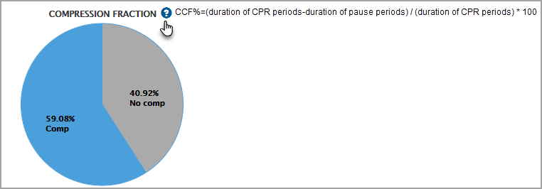
In a real-world cardiac arrest, many things may interrupt or delay CPR such as rescue breaths, pulse checks, and heart rhythm analysis. Researchers found that fewer CPR pauses increase the patient’s chances of surviving. You can use the Compression Fraction pie chart to discover the percentage of time caregivers performed chest compressions during a cardiac arrest.
Blue section: Percent of time CPR compressions were performed.
Gray section: Percent of time CPR compressions were not performed.

Notes:
- This chart shows the duration of whole seconds of combined time for all CPR and pause periods, including AutoPluse and manual CPR.
- The AutoPulse periods are included in the Chest Compression Fraction regardless of whether they are inside or outside a CPR period.
- The Manual Depth Variability and Manual Rate Variability charts do not include AutoPulse compressions.
CPR Pauses
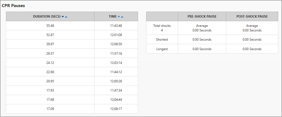
CPR Pauses displays the duration of the pause times, the number of shocks, and the pause time associated with the shocks.

AutoPulse and manual pauses are present
If a case has both manual and AutoPulse pauses, CPR Pauses shows the top 10 longest pauses with a breakout of which were manual and mechanical pauses.
Toggles on the duration and time columns provide quick analysis of all pauses in a 10 row view. Data on each pause can be exported to an 'Individual pause.csv' report.

Total Duration: Pauses that have both manual and mechanical events. This column can be toggled between longest and shortest duration.
Time: Toggles between chronology or tied to duration length.
Mechanical pause: A pause period or a portion of a pause period that falls inside a mechanical time period (shown as blue shading on the charts).
Manual pause: A pause period or a portion of a pause period that falls inside a manual time period excluding any portion that also falls within a mechanical period. For example, if an AutoPulse and manual time period overlaps, the mechanical time period is counted.
Mechanical or manual pauses are present
If there is only one pause period type present, the chart will display in a two column format.

Ventilation Performance
Ventilation Rate
The Ventilation Rate chart displays ventilations per minute. Hover over the dots to view the breaths-per-minute (br/min) value.

If the case includes Real BVM Help, a blue band appears to indicate the target set on the defibrillator. If the target changes during the case, the blue band updates accordingly to reflect the new target. Hover over the blue band to view the target value and its corresponding time in the case. Hover over the dots to see the breaths-per-minute (br/min) value.

 chart.png)
EtC02 Trend
Over the length of the recorded case, the system displays gray dots on the EtCO2 graph that show the peak EtCO2 readings per minute.
Note: If the case does not contain EtCO2 or ventilation readings, this chart does not display.
Note: The EtCO2 values shown represent the peak reading for each minute.

Header: EtCO2 trend title and ventilations with source (centered over the graph)
Gray dots: The peak EtCO2 reading for the minute with a line connecting the dots
Hover: Hover your mouse over a gray dot. The system displays the value for EtCO2 in mmHg or kPa and ventilations (breaths per minute).
Ventilation Volume
Hover over the blue target band to see the target value and time. Hover over a bar to view the ventilation volume.

Blue bars: In target
Gray bars: Outside of target
Ventilation Summary
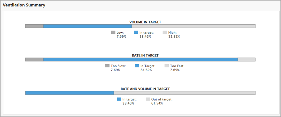
Ventilation Summary contains three charts, Volume in Target, Rate in Target, and a combination chart of volume and rate.

Hover over the shaded area in the Rate in Target chart to view the minutes associated with each target range.


